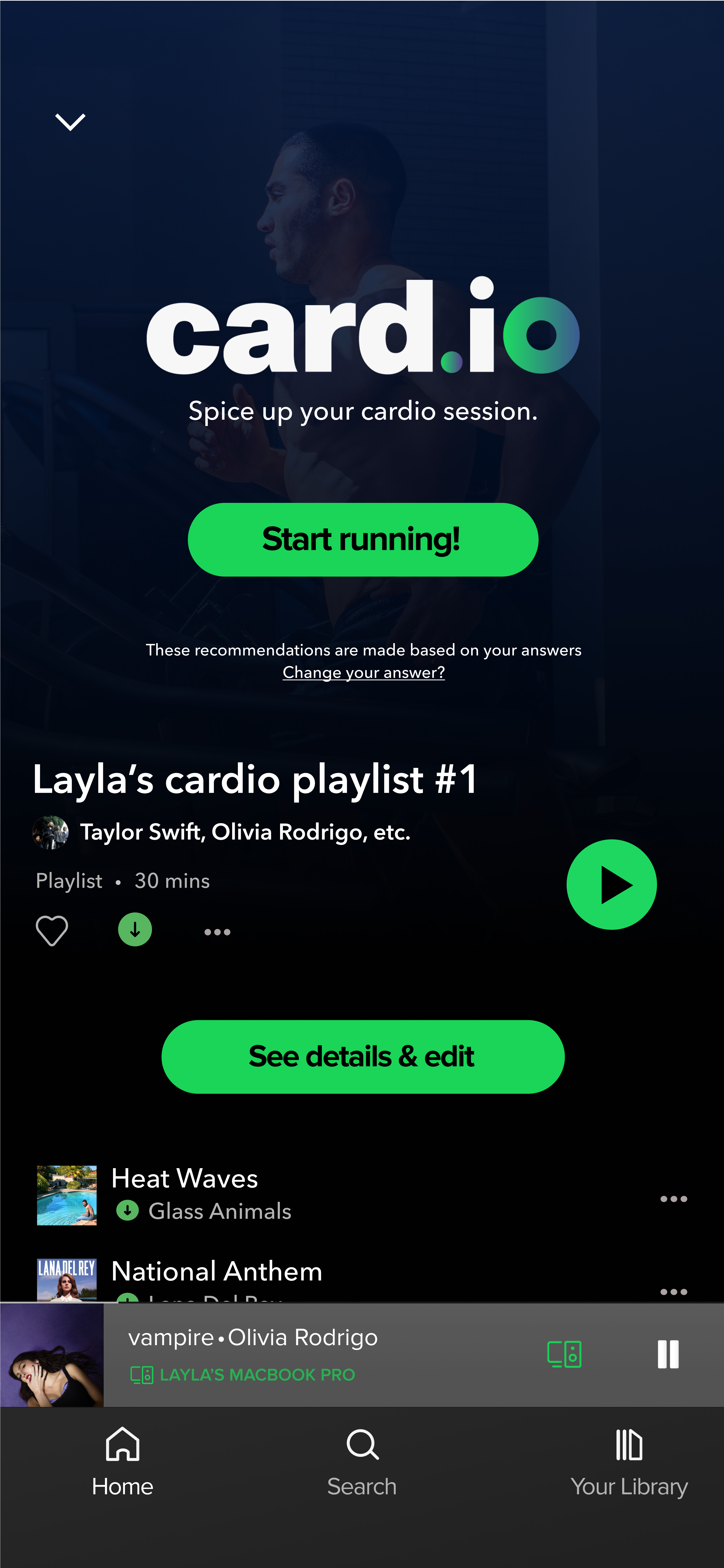
A perfect cardio session starts with the perfect playlist.
card.io is a Spotify feature that caters towards the fitness community and aims to improve the cardio running experience with personalized music selection and playlists.
I worked on this project individually as my own exploration of the UI design field in my undergraduate degree.
Project type:
UX design
Duration:
1.5 month
Tool used:
Figma
The ongoing trend
Many people struggle to stay motivated throughout their cardio sessions, and often cutting their workouts short. However, with the right music, runners can feel more energized and motivated - making it easier to push through.
This need had sparked the trend of cardio playlists.
Fitness influencers makes cardio playlists, where songs are organized to match different speed ranges (phases) of a typical cardio session.
Learn more about the effects music has on running.Trend observation 1
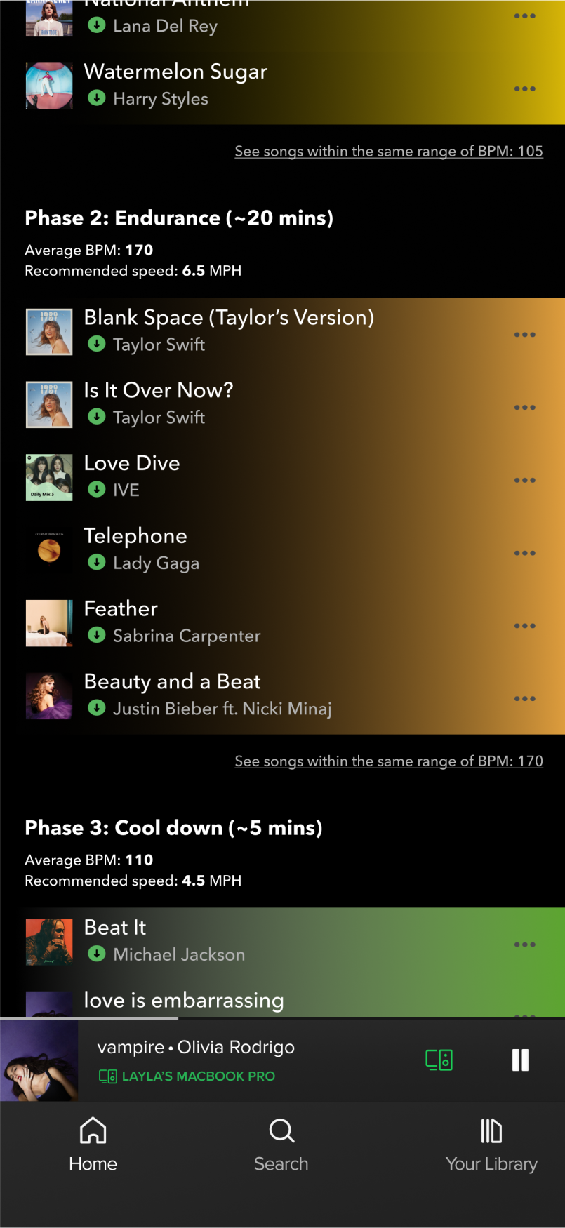
Template for a “typical” cardio session?
Influencers follow a conventional template of a cardio session with 3 phases: Warm-up, Endurance and Cool-down.
Trend observation 2
Requests for artist or album specific playlists.
Viewers usually ask influencers to make cardio playlists specific for their favourite artist or album.
Trend observation 3
Strategically organized songs that can‘t be shuffled.
The playlists are structured to match the current speed range. The faster the treadmill (MPH), the faster the song (BPM).
Research findings (summarized)
I conducted 5 interviews with 5 users that identify themselves as fitness enthusiasts, and have participated in the trend on TikTok with their favourite fitness influencers. After the interviews, I categorized my data into 3 themes, and 1 driving insight.
Theme 1
Unique bodily physiques require customizations...
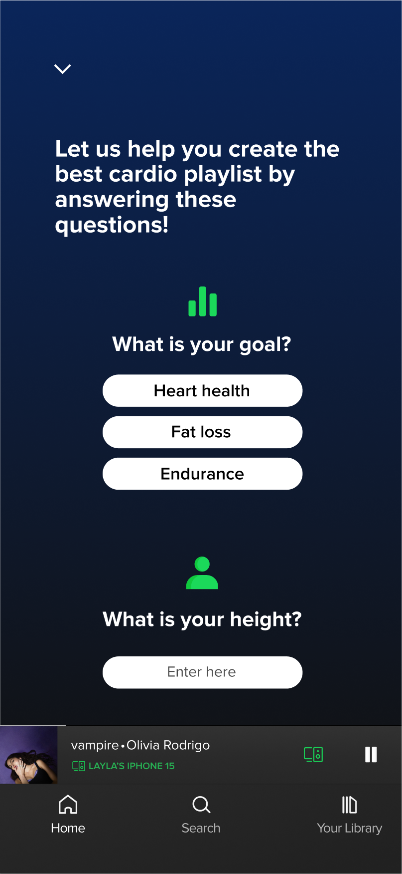
Users need customization based on their unique physical traits: height, weight, endurance limits, etc.
Theme 2
Personal preferences in songs require customizations...
Viewers often ask influencers for cardio playlists based on favorite artists or albums, but still want customization - since they may not enjoy every song by that artist/ in that album.
Theme 3
...Yet, users lack confidence in customizing.
Users find it hard to customize the playlist on their own, without the help of influencers, or test the effectiveness of their playlists.
Driving insight
Influencer-made playlist is considered a good starting point, but personal customization is what makes a “good” cardio playlist.
Driving pain point & “How Might We”
Driving pain point
Runner feels frustrated because she doesn‘t have confidence in customizing & testing the playlist‘s effectiveness on her own.
How Might We
How can I make sure our runner feels informed and confident in customizing & testing her own cardio playlists?
card.io‘s solutions
Solution 1 & 2
Automatically create organized, colour-coded playlists based on users‘ music preferences.
Different phases are highlighted with different colours.
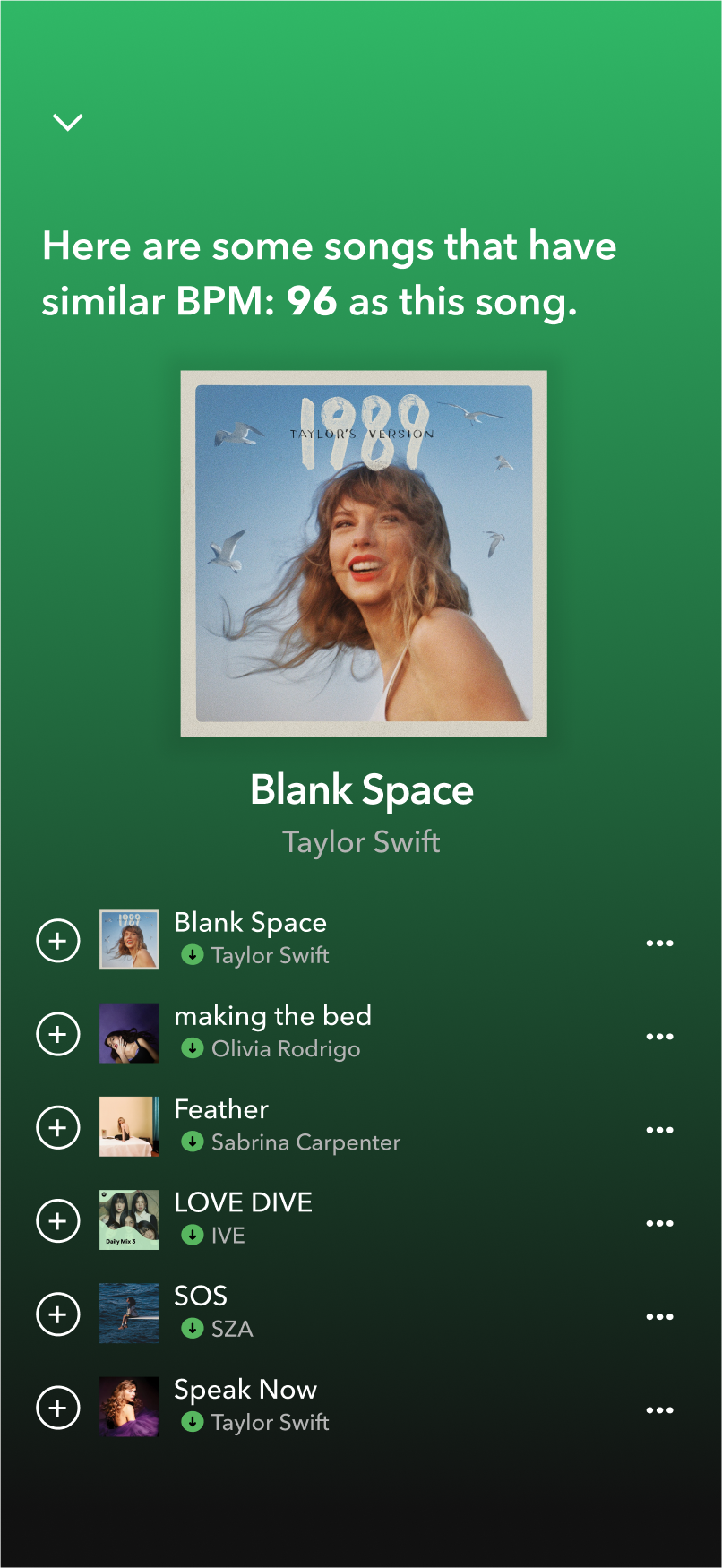
Makes customizing easier - Suggest songs with similar range of BPM.
If Michelle wants to replace a Sabrina Carpenter song that she doesn‘t like, she will have plenty of different song suggestions as replacements.
Solution 3
Offers questionnaire that collects users‘ physical attributes data to create a more personalized playlist.
With this feature, Michelle wouldn‘t encounter the problem about being short anymore.
Solution 4
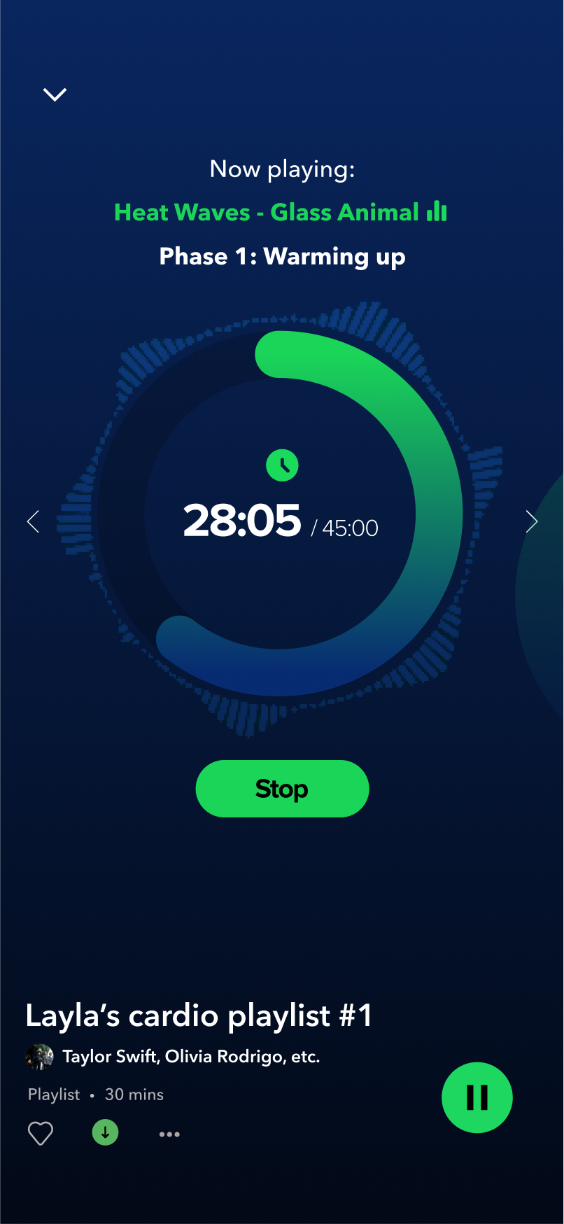
Makes testing easier - Real-time report during running.
Report includes session‘s progress, current BPM, current treadmill settings (speed, incline). Michelle can test her playlist with informative interface that provides sufficient information for her to make her decisions.
Solution 5
Offers more freedom in creating mixed playlists with different artists, albums, genres, etc.
With “Manual Mode”, Michelle can freely add any songs she likes to the cardio playlist while still having all the features above for support.
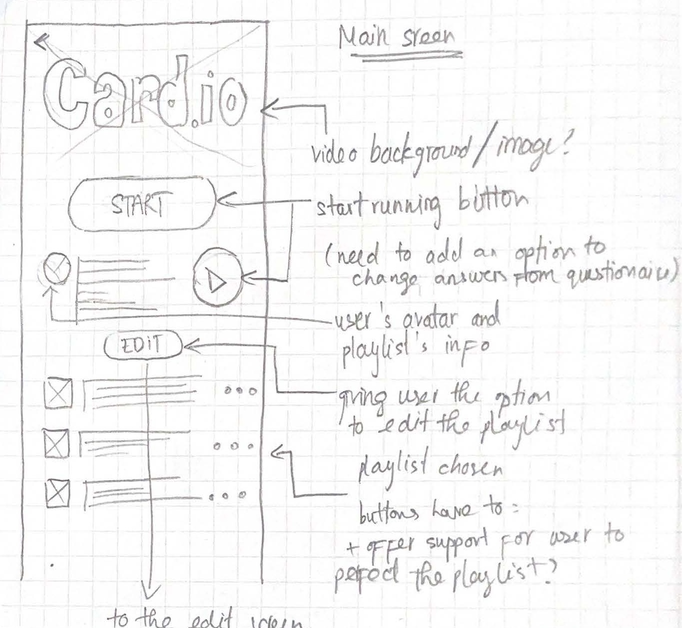
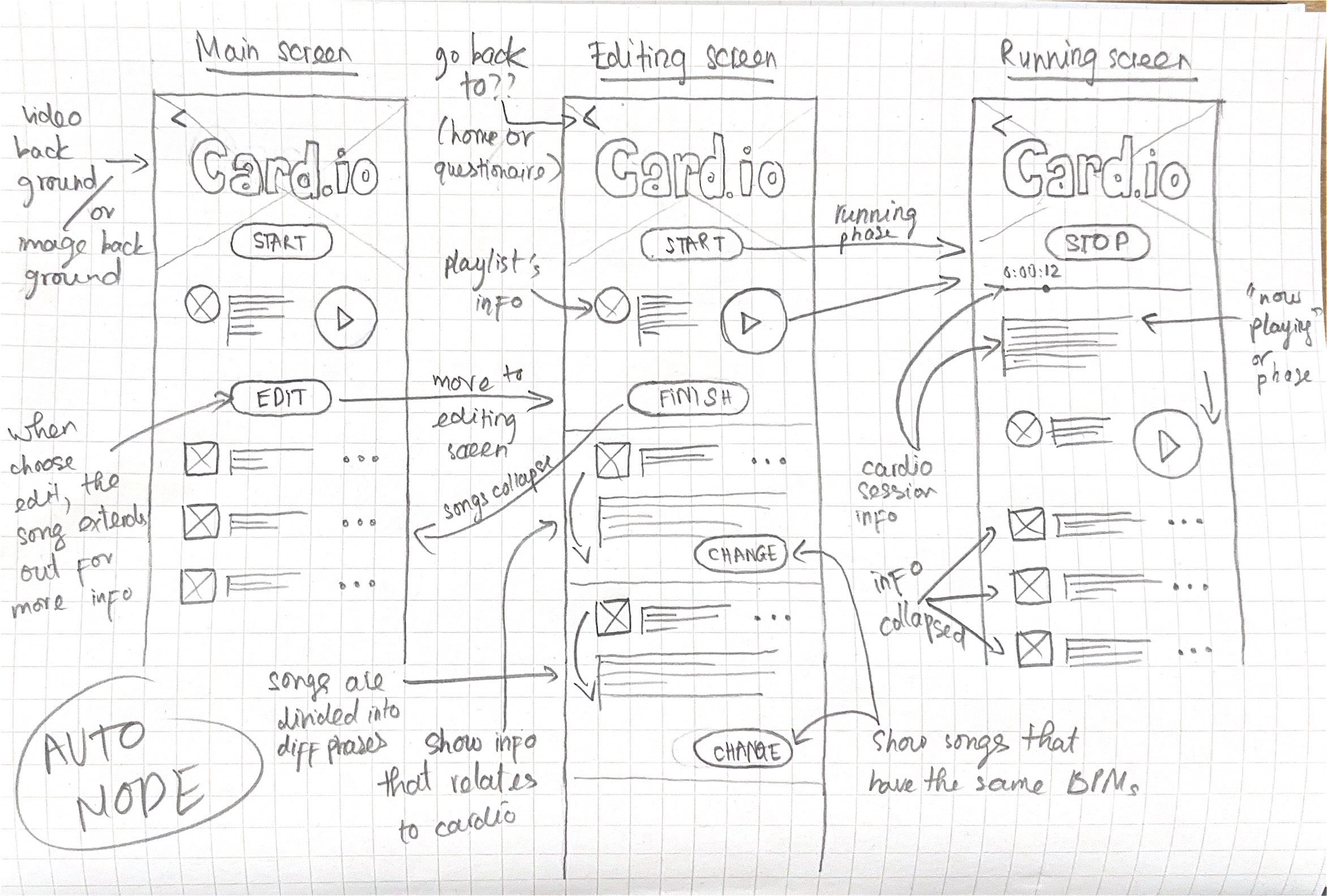
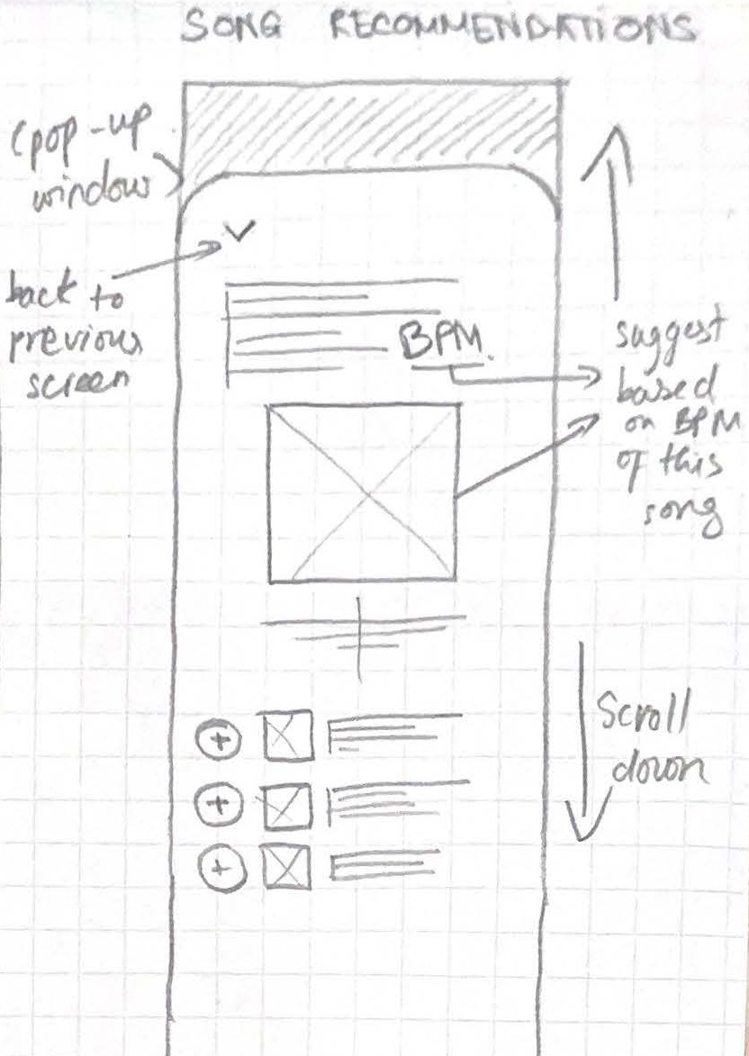
Conceptual sketches
First iteration & User testing
First prototype of card.io.
I conducted a Heuristic evaluation session with another UX designer to discover issues with this interface.
Using slide bar as progress indicator gives a false impression of interactivity.
The straight slide bar in card.io resembles the draggable bars on platforms like YouTube or Netflix. But in card.io, it functions solely as a progress indicator and isn’t interactive.
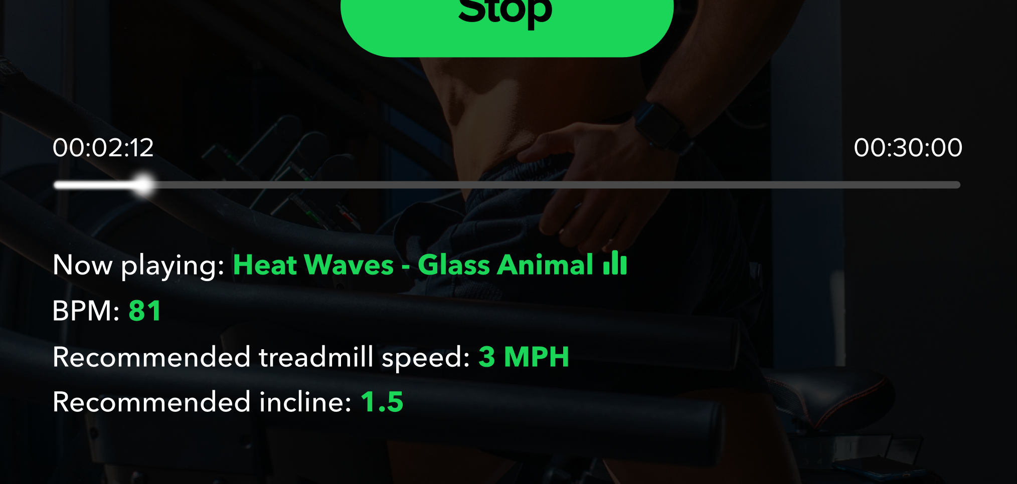
Linear progress bar is perceived as interactable on multiple platforms.
Next up, I conducted in-person user testing with 2 users.
With a day-pass ticket of a gym nearby, I asked them to set up the playlist in their phone, and use the feature while running, or after running if needed.
Again, I organized the responses into 2 reoccurring themes.
Reoccurring theme 1
Needs for glanceability.
Users are constantly moving physically, resulting in struggles in receiving small texts information, or thin progress bar.
MPH, BPM, Incline, etc. are displayed all at once, along with progress bar while having no clear hierarchy, causing cognitive overload.
Reoccurring theme 2
Struggles with small interaction areas (tapping interaction)
Small touch targets (e.g., the “next” button) are difficult to press accurately during running.
These tapping interactions require high precision (have to tap precisely on an area of the interface).
Key UX improvements
After identifying key issues with all data collected from Heuristic evaluation and User testing sessions, I went ahead and implemented 3 key UX improvements to the final iteration.
Key UX improvement 1
Process bar → Circular design
→
First iteration: Linear progress indicator
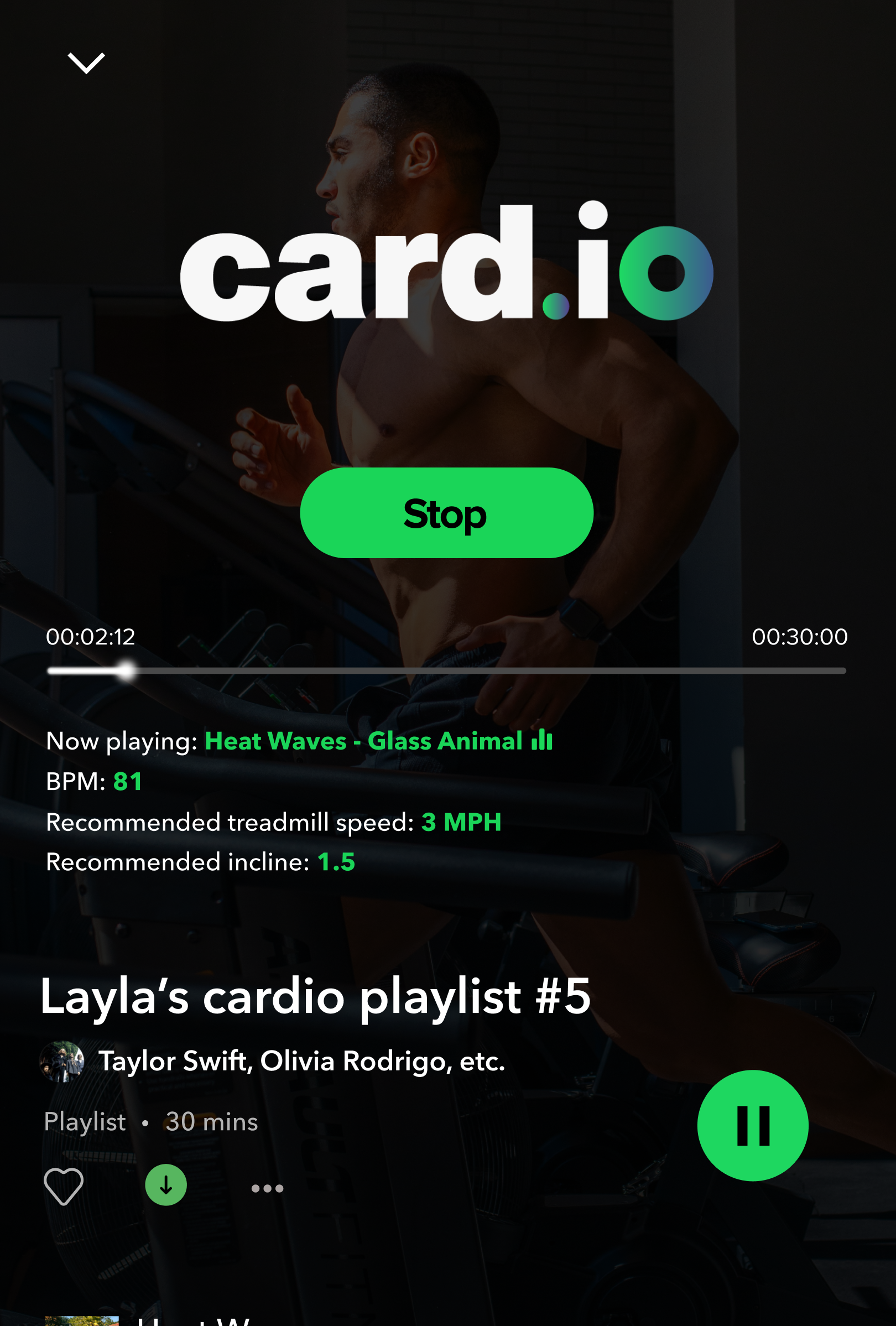
Final iteration: Circular progress indicator
More conventional non interactive progress indicator.
Remove confusion with the progress bar for streaming services.
Able to incorporate a thicker bezel, improving glanceability.
Key UX improvement 2
Tapping → Swiping
Large interaction area, hard to miss.
Low precision, high accuracy (compare to tapping which requires high precision).
Easy to interact during intense physical activities.
Key UX improvement 3
Chunking information into groups
→
First iteration: Information are left-aligned in a paragraph-like fashion
Final iteration: Information is categorized into groups, seperated by a swipe.
Instead of showing all information at once, sort them into 3 groups separated by a swipe.
Reduce visual clutter, improve glanceability during intense running.
Resemblance to a modern treadmill interface.
Looking back...
Customize to follow WCAG standard more (using different Figma plugins: A11y Colour Contrast Checker, A11y Text, etc.).
See if there is a better way to give user support in customizing other than suggesting songs with similar BPM.
I want to conduct more user testing to gather more data for the questionnaire.
Takeaways
Design with a clear goal in mind.
Pay attention to every steps as it will all come together and it will all have to make sense in the end.
Design for accessibility.
Other projects

Samsung Knox Manage
Samsung Knox Suite is a proprietary security and management framework pre-installed on most Samsung mobile devices.
UX design internship
B2B UX

Jackalope
Social event and community finder app, helping international students settle into a new country, with AI-powered suggestions and built-in feedback mechanisms.
UX design & research
B2C UX
Designed and coded by me using Tailwind CSS and Next.js
© 2025 Hung. All rights reserved.